Multiple Technique Practice Piece
This may be the year I don’t get any projects done, just some studio organization and some practice. I followed Melanie McNeil’s suggestion about inventorying books — between art and textile books, I have 300! (It took me about 3 days so I haven’t inventoried the other things she suggested, yet.) I emailed the list to myself, and that way, if my house ever burns down or flies away in a hurricane, I have the list for insurance. I could have just saved the ISBN number, but I went ahead with author, title, and topic. It’s interesting to see that I have lots of books on technique, and very few on individual artists or museum collections. I am determined to work through some of those technique books!
That said, the surface design methods I tried here, mostly came from inspiring blog posts and magazine articles.
First I took a bunch of old linen napkins, and did some free motion quilting across them, trying out different types of thread, including a 12-weight cotton, and a size 50 silk. (Inspiration for this part — Doreen at Treadlemusic, for example this post. She is the master, but I can practice.)

Practice piece from old linen napkins.
I had sort of a plan to outline some shapes with quilting, and then go back and paint them with small areas of color. Some of the napkins had damask spots, and I was hoping to highlight how the threads float and change direction in this weave. This section below I wanted to look like strings of beads.

Outline for painted circles.
I have seen a few mentions lately of acrylic inks and how well they work on fabric. However I mis-remembered the product name and bought alcohol inks instead.

Alcohol inks.
I decided to get a little more bang for my design buck, by masking off part of the fabric with leaves and flowers. (I am pretty sure I got this idea from Joanna at The Snarky Quilter, but I can’t find exactly which post planted the idea in my mind. Possibly this one.)

Flowers and leaves to protect part of the fabric from color.
(Looking at this photo, I can see that it would be pretty to have a big white-work quilt with a few leaves and flowers painted in with watercolor pencils. Another time.)
First I just dropped the ink onto the cloth, but the ink didn’t spread like I had hoped, so then I mixed some with the extender and sprayed. Especially on the damask linens, which have dimension from long floating threads, I sprayed from low angles. One thread could have one color on top and different colors on each of the sides. I also dropped the ink cleaner in spots to see if I would get watered effects, which I did, but not very noticeably.

Leaf shapes in the ink spray.

This shows the dotty effect of the sprayed ink.
The inks didn’t affect the hand of the linen much at all, it is still supple.
The overall effect was some a nice pastel background, with a series of unfortunate drips. So the next day I went back into it with liquid acrylic paints and textile medium, to try to make the drips less obvious.

Acrylic paint and textile medium on top of the sprayed inks.
This did not salvage the whole piece, and some of the paints really stiffened up the surface to an unacceptable degree. BUT that does not really matter. Because it is practice. And because along the way I took lots of photos, and I can run them through Photoshop®. That way I have a lot of the fun of surface design without any of the mess.
Over-painted section.

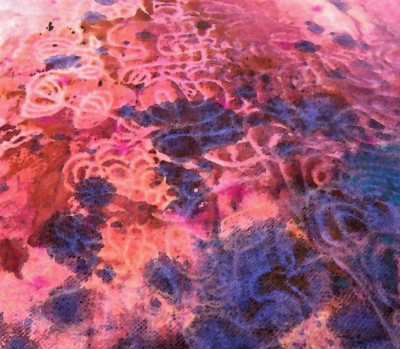
The painted section reversed and reflected.

Color change.
What do you see in that image?
So those are the experiments on side one — next up: more experiments on the reverse.


Well, grasshopper, I see you’re about ready for digital fabric printing with those lovely PhotoShop edited shots of your work. I suggest Spoonflower, as you can set up an account, play with your designs, and save them without buying a thing. About those pesky drips, I can never predict when that will happen with spray bottles. I’ve used Ranger Dyelusions spray paint made for scrapbooking, and it can certainly be erratic. Have you tried going over your stitched pieces with paint on a roller? I’m thinking that way the paint would adhere to the raised areas, but not the stitched ones. See the work of Deidre Adams for the effect I have in mind. To get the ink/paint to spread more try spraying your cloth evenly with water so it’s damp but not soaking, then applying paint.
I was thinking I’d do a few pieces like that to use up supplies, and then I’d be done with actual surface design, and would move on to digital design, and eventually follow your lead and go over to Spoonflower when I had something I liked, but now you are giving me more ideas I just have to try! When I do go to Spoonflower, I will definitely benefit from the advice in the posts you did about that experience, I have read them with interest.
Well, those are pretty. Even if you don’t use them for anything, experience is never wasted 😊
That is so true, and yet it seems that we have to learn that lesson over and over, it is so hard to feel that the risk a few pieces of material and some time is justified. But I have so much fun when I do!
I NEED A “LUV” BUTTON!!!!! Those practice paint pieces (luv alliteration!!!! LOL!)!!! And thank you for your so sweet words and link! I really try to stress the “practice” must be FUN!!!! Awesome post!!!!!
Glad you liked it. Even if I never achieve the intricate look of your pieces, I have learned so much from seeing the possibilities you present and from the details of the process that you share so freely!
You have so beautifully encouraged me by your words, for that is precisely the reason I blog about that process!!! Sharing my passion/obsession and seeing it “caught” by others is such sweet reward!!!! Hugs…………..
Hmm, my comment didn’t get posted……..maybe because I didn’t ‘post’ it haha
I looked at the last 2 pictures and they were fuzzy, had to go to the oven and on walking back I could see them more clearly, they looked like a royal heraldic pattern for a shield or something!
That”s an interesting image. I keep seeing big intricate Christmas ornaments, and also some stern faces.
This looks fun. I’m usually too worried about wasting fabric and ink to mess around like this but now feeling inspired to give it a go, especially as I’d never considered digitalling enhancing them and then getting them properly printed. Thank You!
Yes, isn’t it amazing how worried we can be about wasting supplies, even just a piece of paper! We will spend money to go see a movie but we feel like we can’t spend that same amount on practice materials. Fortunately I had read somewhere that stained linens are interesting-looking when dyed, so I felt like I was repurposing otherwise unusable napkins. 🙂
Aren’t you having fun?! What a good way to get some mileage from a stack of old damask napkins–and it’s fun to see Doreen’s techniques applied here. I am looking forward to you trying the whitework with watercolor flowers–that looks like it could be very striking, too!
I think I will do some similar pieces, with just one napkin at a time. It’s fun to get big sweeping areas of color on a piece with multiple napkins sewn together, but it’s irresistible to take advantage of 4 beautifully hem-stitched edges!
Absolutely beautiful!!!
Thank you! We will see how the next steps turn out. 🙂 But like Zippyuilts said, experience is never wasted!
What a wonderful experiment. Beautiful!
You’ve done some great work here … beautiful. You asked what we see in the fabric, well I see a oblong Christmas decoration in both. Love that green and blue effect. Great experiment i say.
I see that Christmas decoration too.
Pingback: TextileTopia | Deep in the Heart of Textiles