The Endeavourers’ Reveal Day 14 — Color Theory
My inspiration for this quarterly theme was a color study book from 1821, Werner’s Nomenclature of Colours by Patrick Syme. It is my favorite color book because the author matched each color to items from nature, including plants, animals, and minerals. His descriptions read like poetry to me–
Blackish Grey — Back of Nut-hatch, Old Stems of Hawthorn, Flint
Scotch Blue — Throat of Blue Titmouse, Stamina of Single Purple Anemone, Blue Copper Ore
Sap Green — Under Side of lower Wings of Orange tip Butterfly, upper Disk of Leaves of woody Night Shade
I wrote more about the inspiring color book here, and you can also get a look at it at this wonderful website by Nicholas Rougeux.
For my piece, I wanted to create the look of a color swatch book, and capture small colorful treasures of nature like those Syme described.
Construction was very simple. First I sewed together horizontal stripes of batik fabric.
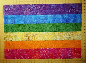
Batik stripes.
Then I cut a grid out of Pellon Lutrador and painted it with Jacquard Lumiere textile paints, in vertical stripes that blended at the edges. (I didn’t have a true orange so I used copper.) By crossing the colors, I could have a gamp showing the interactions of the colors with each other.

An overlay of vertical stripes, allowing each color to interact with all the others.
Then I pulled out my favorite glossy and metallic threads, twisted them into cords, and couched them down the centers of the vertical stripes so they would float across the openings. Wherever a batik color square met the same color in the painted grid, I added a little butterfly of yarns in the same color, just by pulling open the plies of the cord and tucking the yarns in.
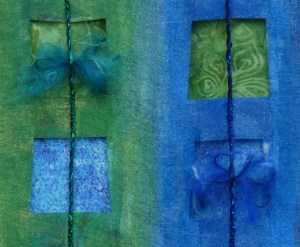
Butterflies of yarn bring texture to an area with no interplay of colors.
Where a batik color square met its complementary color in the painted grid, I added something from nature — a little stone, butterfly wing, or berry — to echo the color of the border in the center.
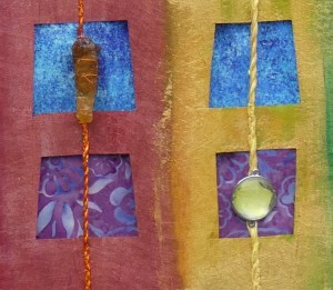
Each small section of the piece becomes a color study of its own.
I would like to add more of these.

Color Play
This is the rare piece that looks better in person than in pictures, I think. I did not put borders around the top grid, because I envision taking it off and using it on other backgrounds of silk or cotton, to see how the colors interact.
What I like about this piece is that it reflects my own taste in hues of colors. I love the metallic look of the paint on the Lutrador, and the glitzy cords. It’s a good piece for color study and I had fun making it!
You can see how everyone else interpreted this challenge here at The Endeavourers home page!


Josef Albers has nothing on you. I love your symbols for specific color interactions. It’s fascinating to see how the yellow stands out against almost any other color.
Oh, thank you so much! I was thinking of it as a “color interaction toy” the whole time I was making it. And you are right about the yellow — if I was going to make a real finished quilt, I think I would play with the ratios of the different color areas to get them to look more balanced.
Until reading a few of the posts today, I hadn’t heard of the Warren’s book, so it’s now residing in my Amazon cart. I can see why you’d like to create more pages, this one is so full of color and I like the little embellishments. I hope you post the pages you continue to create and add.
It is all available online at the Internet Archive at archive.org too —
You may prefer a physical book but I like being able to easily copy and print the pages too. 🙂
I absolutely LOVE your quilt with the artifacts on top. You also sent me on a trip to see Werner’s Nomenclature and other Endevours! I think I was supposed to be cleaning…but this was way more delightful. For some reason it brought up The Lost Word’s by Robert McFarland and the gorgeous paintings by Jackie Norris.
Oh my gosh, you sent me down a rabbit hole as well! I have just had a lovely time at Jackie Morris’ website! Right up my alley.
That’s a fun piece, and it’s nice to read about techniques I’ve never tried 🙂
I can see the colours and details of this quilt better here than on the Endeavourers and I love it even more! I hadn’t appreciated that the natural objects were colour coded. I also like the way you have kept the front as a sort of detachable frame so you can use it with other backgrounds 🙂
Thanks! Isn’t great how we both started with the same book and ended up in such different places? I love your piece so much — with the message you wrote to the “unknown author,” I can see it hung up at a health fair, as a talking point to bring people in to talk about learning styles or something!
that’s beautiful and interesting. Thank you.
That is an amazing piece and use of color and design!
Thanks, Tierney! I think of it as a practice piece for if I were ever going to create a “real” one! 🙂
Your work is amazing. I know I always say that, but every time I read your blog and see your work I’m envious of your talent. I also went to Nicholas Rougeux’s website — how wonderful! And how helpful to artists who work with colors. Bravo, my friend!
Claudia, you are so kind! You introduce me to so many wonderful artists on your blog when you showcase their work — Yulia Brodskaya is one especially memorable one. I just make a few things a year out of habit and because it keeps me calm. 🙂
Pingback: Notes on Design Styles | Deep in the Heart of Textiles