Are You a Looker or a Leaper?
Are you the kind of person who considers every choice? Or do you just plunge ahead with the first one that appeals to you?
I tend to err more on the looking side – I can get caught up in so much dithering research that it hinders me from accomplishing anything. I have to give myself little pep talks – “Use your intuition! Take action! Follow through!”
A few days ago I was definitely reconnoitering before leaping. I was congratulating myself for saving time and materials, by using PhotoShop Elements to audition different quilting effects before actually stitching them.
I carefully created six different versions and picked the one I thought would look best – a pale gray spiral design. But I might as well have saved the wear and tear on my clicking finger, because I did not take into account one tiny little detail – what thread I actually had on hand. Not only did I not have any pale gray, I didn’t have much in the way of pastels. I didn’t have enough of any one color of quilting thread to do the whole quilt.
I live 20 miles from the closest quilting shop, and I have a rule against going anywhere for just one thing. I tell myself that it makes me more creative to have to solve design problems with what I have on hand.
So I decided that I would use several different colors, some light, some dark, and I would let them sort of swirl around each other. This is where the looking or leaping issue arises. I had already done several hours of photo editing, and one actual sample, with a pastel multi-color thread that was just too cutesie. Should I do another sample, to see how light and dark spirals would look next to each other?
Nah. Intuition quickly reminded me that there were already contrasting light and dark fabrics in the quilt- surely contrast in the stitches would add more interest!
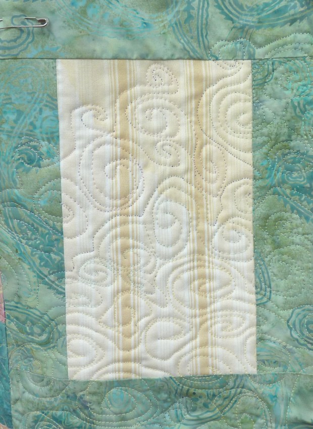
So I skated ahead – pale yellow swirls – very nice. Cream-colored spirals – nice too. Ice green – ooh! lovely! See? This is one textile artist that can command color! Okay, time for some cadet blue -it’s not even that much of a value change, it’s really more of a mid-tone –
eesh.
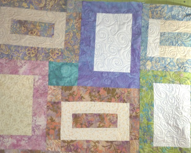
It showed up as really dark. And whereas my free-motion spirals had been going pretty well in the pastel threads, once I switched to the darker color, I seemed to lose my fluidity as well. The spirals looked like they had snagged on something. I tried everything – rethreading, new bobbins, new needles – but nothing helped. The strong contrast made every little mistake jump out.
Maybe I should stop and pick them out?
I heard that part of me that really really hates to undo anything rationalize – ” You know, sometimes you just can’t judge based on such a small part. You should just keep going. You can use pretty much any color as long as you repeat it somewhere else in the piece, so just use more of those stronger colors.” I listened.
By the time I knew for sure that the dark color had been a mistake, it was everywhere.

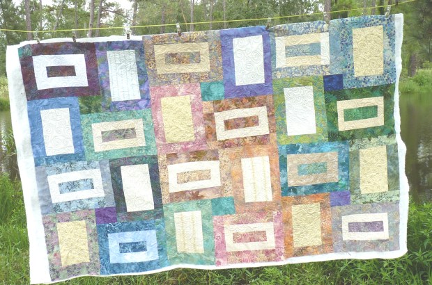
I make my quilts in sections, so this is just half, but I think you can see the light and dark spirals
Now I am just hoping that when I wash the quilt, it will puff up and hide the thread! Next time I go to the quilt shop, I”m buying lots of muted colors of thread.


I loved this! In a week that has seen me ripping out stitching in several different quilts (three different times in one piece!), I was so glad to read of your intuition and subsequent second guessing. If only we followed it the moment we had it! Thanks! 🙂
When I make a mistake in something that’s for myself, I just live with it and say I’ll know better next time! If it was for someone else, I’d be fussier about getting it right. 🙂
I loved the spirals when you were experimenting with the possibilities, and I think the dark thread came out lovely!
Thanks! I guess the discrepancy between what I THOUGHT it would look like and what it ACTUALLY looks like is what’s giving me doubts. I’m still hoping for rescue by washing machine agitation.
I’m a looker, too. But I’ve learned through knitting to listen to that intuition when it tells me to rip now or regret later! I still think the quilt looks great.
Pingback: Getting the Hang of It « Deep in the Heart of Textiles