The Endeavourers’ Reveal Day — Circles and Squares
I am part of an online art quilt group that completes quarterly challenges. This time our theme was “Circles and Squares.” I spent about two months wondering what on earth I would make for that, and then I remembered photos I had taken at a classic car collection, and I happily set to work.
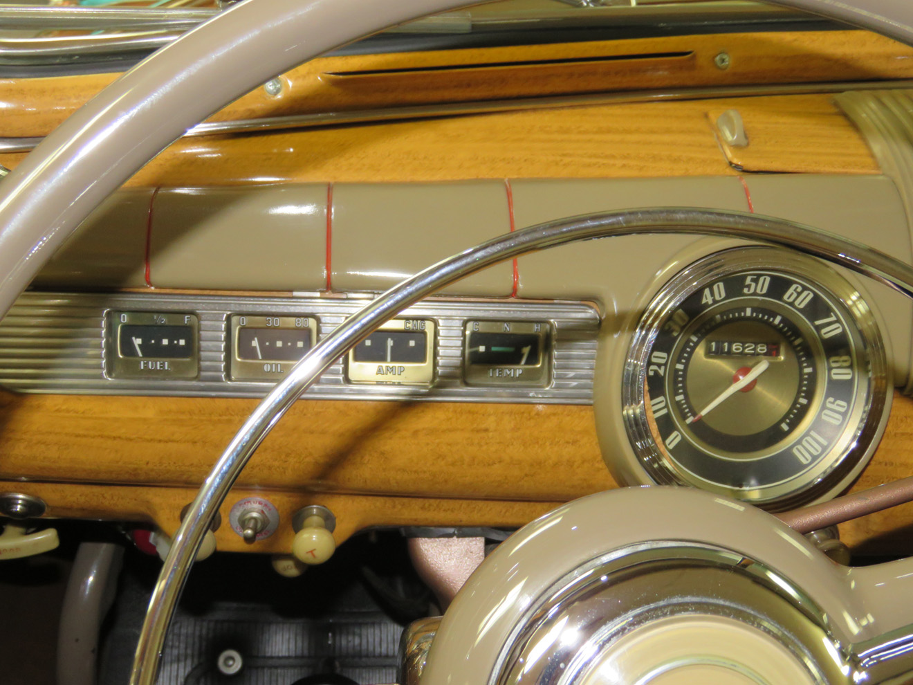
Dashboard of a classic car.
I took some liberties with the shapes in the photo, to fit the theme better.
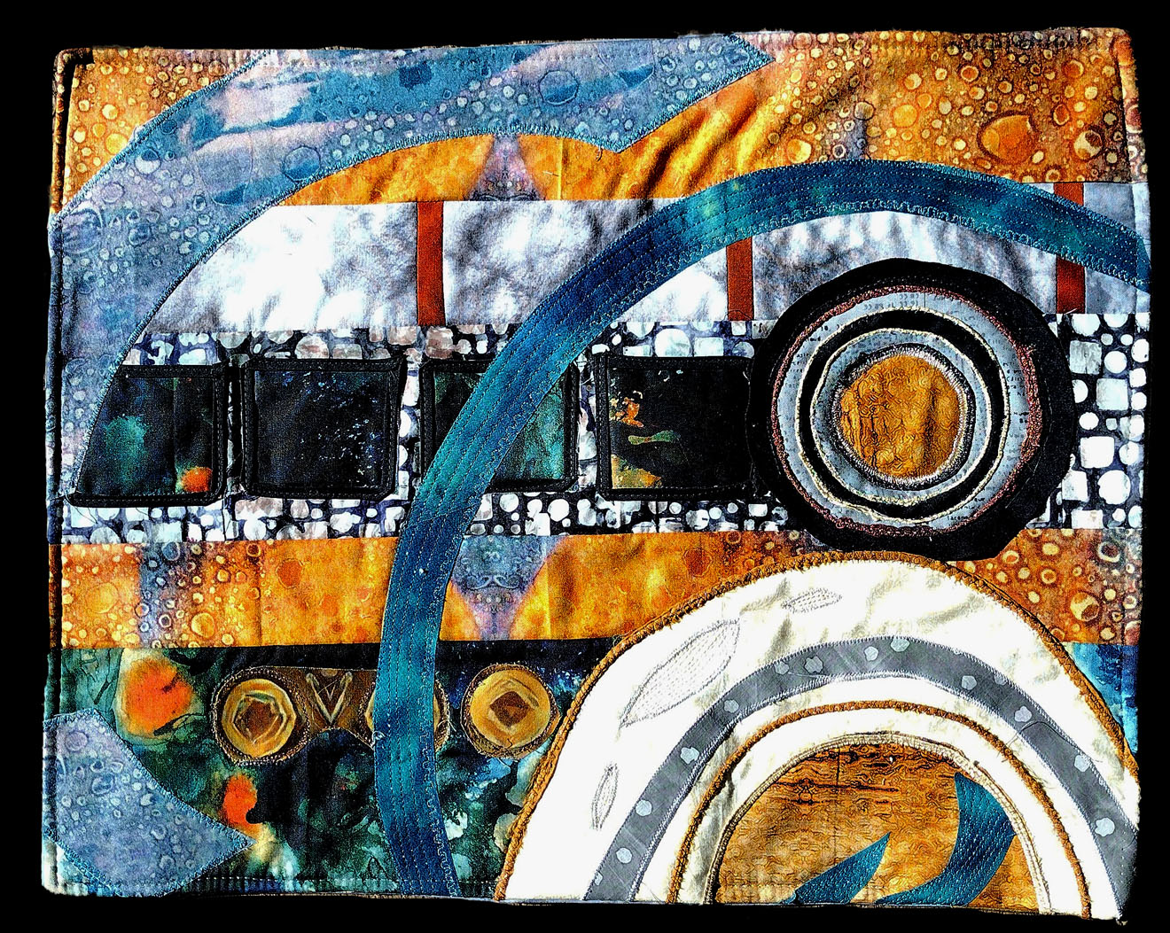
Classic Dash.
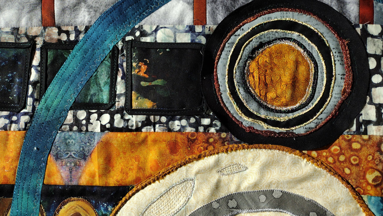
Couching and stitching on the applique shapes.
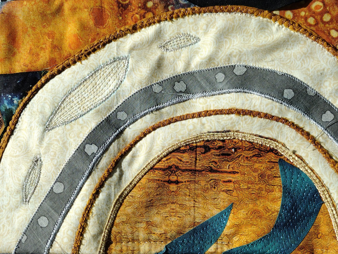
Close-up of some of the stitching.
I was undecided about adding in the numbers and needles in the gauges, but in the end I decided to just stick with the basic shapes. What do you think? Would the numbers add to the representation? Or is it better to leave it more abstract and let the viewer come up with their own interpretation? I am hoping to do a series, so I would appreciate any input!
If you would like to read more about how I constructed this piece, and see how other people responded to this theme, please visit our group site at The Endeavourers!


oh, i love the abstract direction you took on this – it really makes it a work of art and I personally like it the way it is!
Archer
Thank you for your kind words, Archer!
I like the more abstract. And I really like this!
Thanks, Dawn, that means a lot coming from you because I really admire your work!
Oh, what a kind thing to say. Thank you
I have had the pleasure to see this in person! It is beautiful…my mind went from classic car dashboard to the cosmos and to oceans. It was stimulating and I enjoyed the ride! The colors are vibrant and the artistry is exquisite.
Yay, I am glad it brought other subjects to your mind! Thank you!
I think your fabric choices are wonderful. Using numbers and needles on the gauges would not improve the work.
Thank you, Laura Kate, I was glad to hear your opinion!
I think it’s better without the numbers. It’s a true piece of artwork. Anyone with some experience in quilting will immediately recognise the level of expertise such a piece requires. But it’s the artistry that I most enjoy!
Thank you so much! The consensus is definitely for this no-number version. 🙂
I like it just as it is. The color choices are so good! Your inspiration photo was a good one!
Thank you, Wendy, I really had fun with this piece!
You are really clever! I would have never imagined this, yet seeing your original photo and then the picture of your quilt, it translated beautifully. As for adding more details, I prefer the abstract. For instance, I see a camera lens and a strip of film, I also “see” a bicycle tire up close, and I see what you imagined with the aid of your photo. That’s the beauty of a creation like this.
Thanks, Alys! I liked hearing what you saw in the piece; it has been great to hear the different perspectives! 🙂
I think this was such a clever inspiration and I think it is perfect just as it is. I too considered more detail and decided on ‘less is more’ for once in my life! If you make a series, you might find a different one seems to want more embellishment. Or, if undecided, you could take a photo and draw more detail on that to see how you like it… 🙂
That is a good idea, about drawing on a picture!
Yours was amazing, so evocative of an exotic locale, and I really liked your color palette too!
Oh wow what an absolutley beautiful piece of art.
I am Late to this but I think it is good as it is, No numbers. Too distracting.
The colours are perfect!
Thanks, Susan! I don’t know anything about how that SAQA fabric collection was put together, but there were about 10 fabrics from 10 different artists, and they all had really good strong color and went together well.
Happy Thanksgiving!
Me
Wow what an amazing piece, it did not need the numbers, wonderful as it is!
Seeing this rather late – I get a “music of the spheres”/cosmos type vibe that I like a lot, probably more than with numbers etc.
Ceci
Thank you so much!
I like it without the numbers!