The Endeavourers’ Reveal Day — Portrait Two-for-one
The quarterly challenge for this online art quilt group was “Portrait.”
As usual, I had lots of ideas, but as the deadline approached, I chose the least complicated of them.
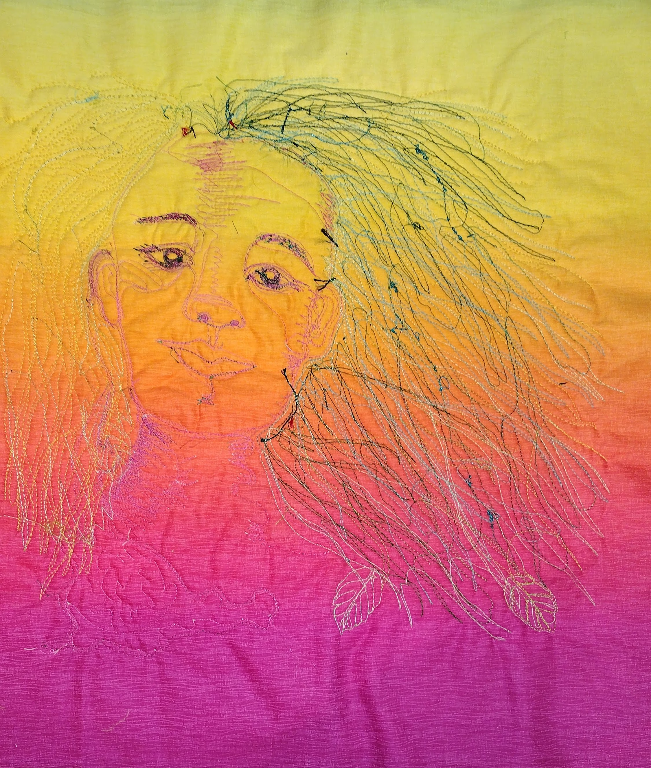
I had taken an online workshop from Melanie Rivers in intuitive portrait making. In the class Melanie directs you in the placement of ovals and lines to make a proportional face — I have taken the class three times and each time my results looked totally different, and I have liked all of them. I thought this one would be interesting to translate into fabric:
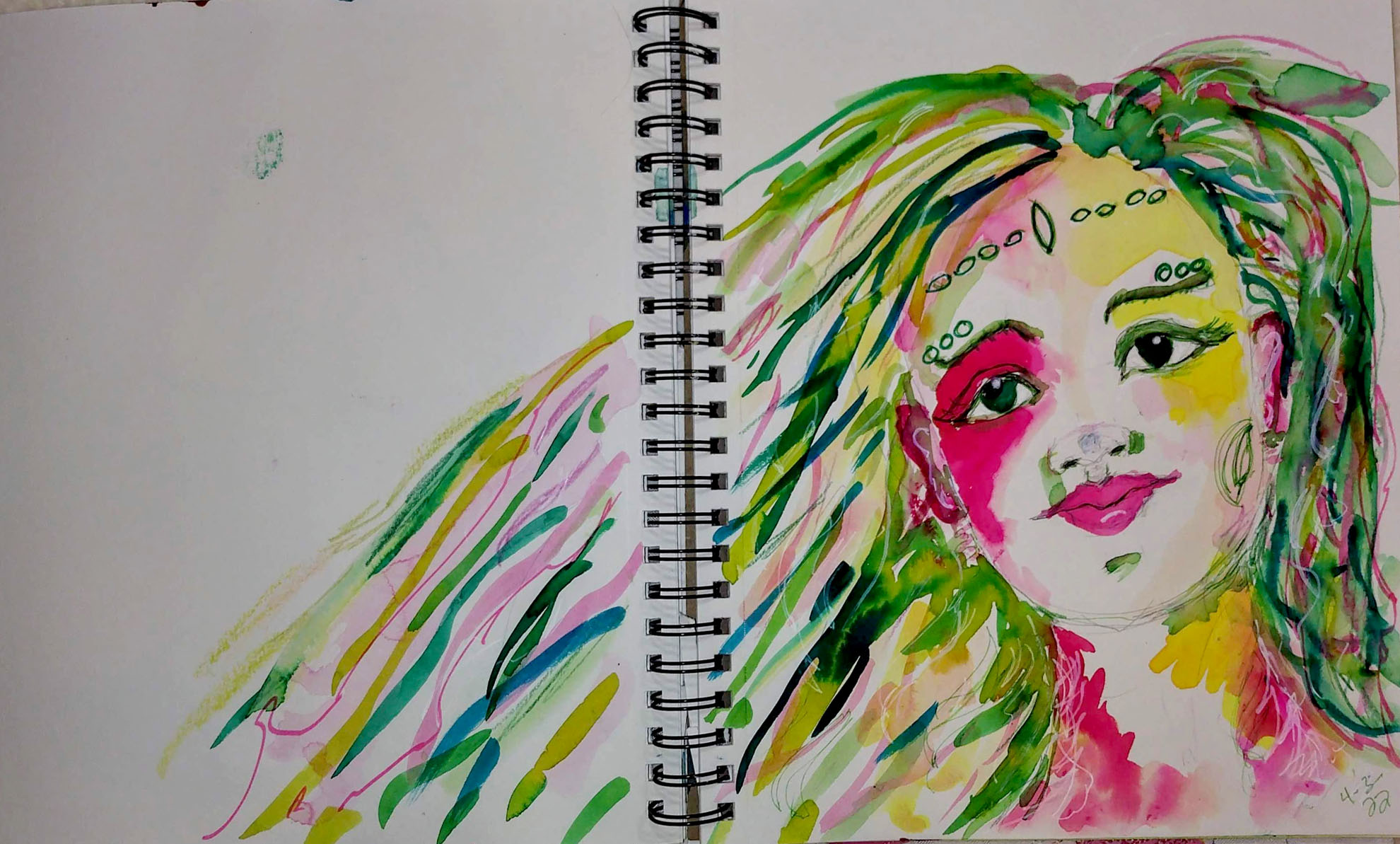
Watercolor sketch from a workshop.
For the front I used an old linen napkin, and for some of the applique fabric and the backing, I chose Gelato Ombre by Maywood. That fabric has a beautiful glowing look, and small sketchy lines that add to the texture. I planned to turn the backing to the front for binding.
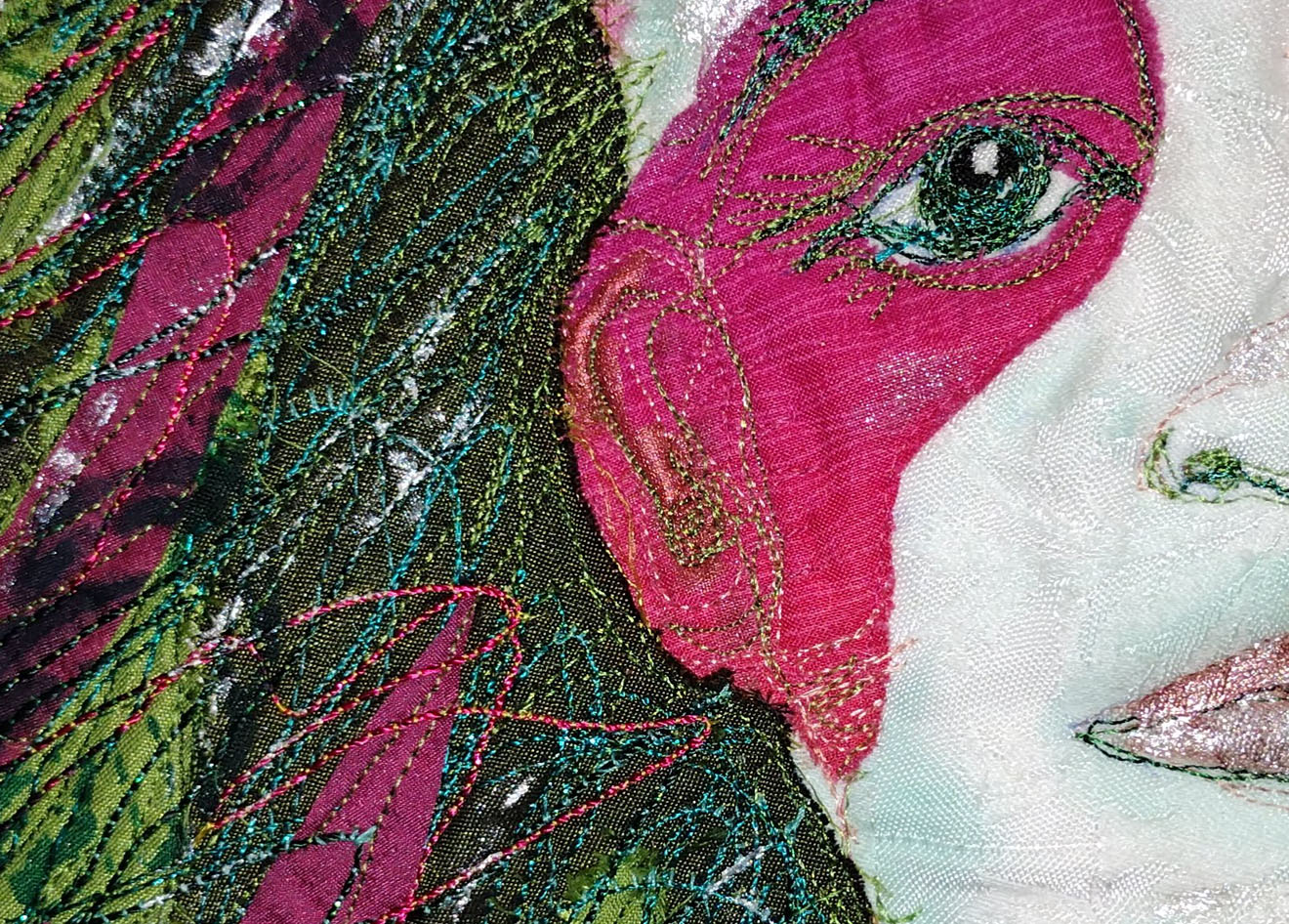
I drew on the napkin with a Frixion pen, and appliqued the large color blocks, and then started the thread sketching. It was tricky to use stitching to define the details, without mashing those parts of the face that should be projecting out — not something you have to worry about with regular drawing materials.
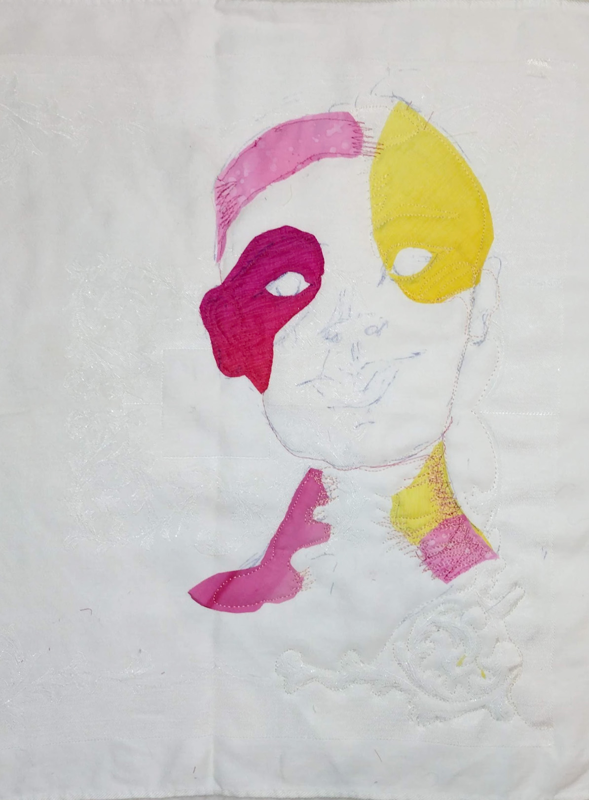
Pen sketch and applique areas.
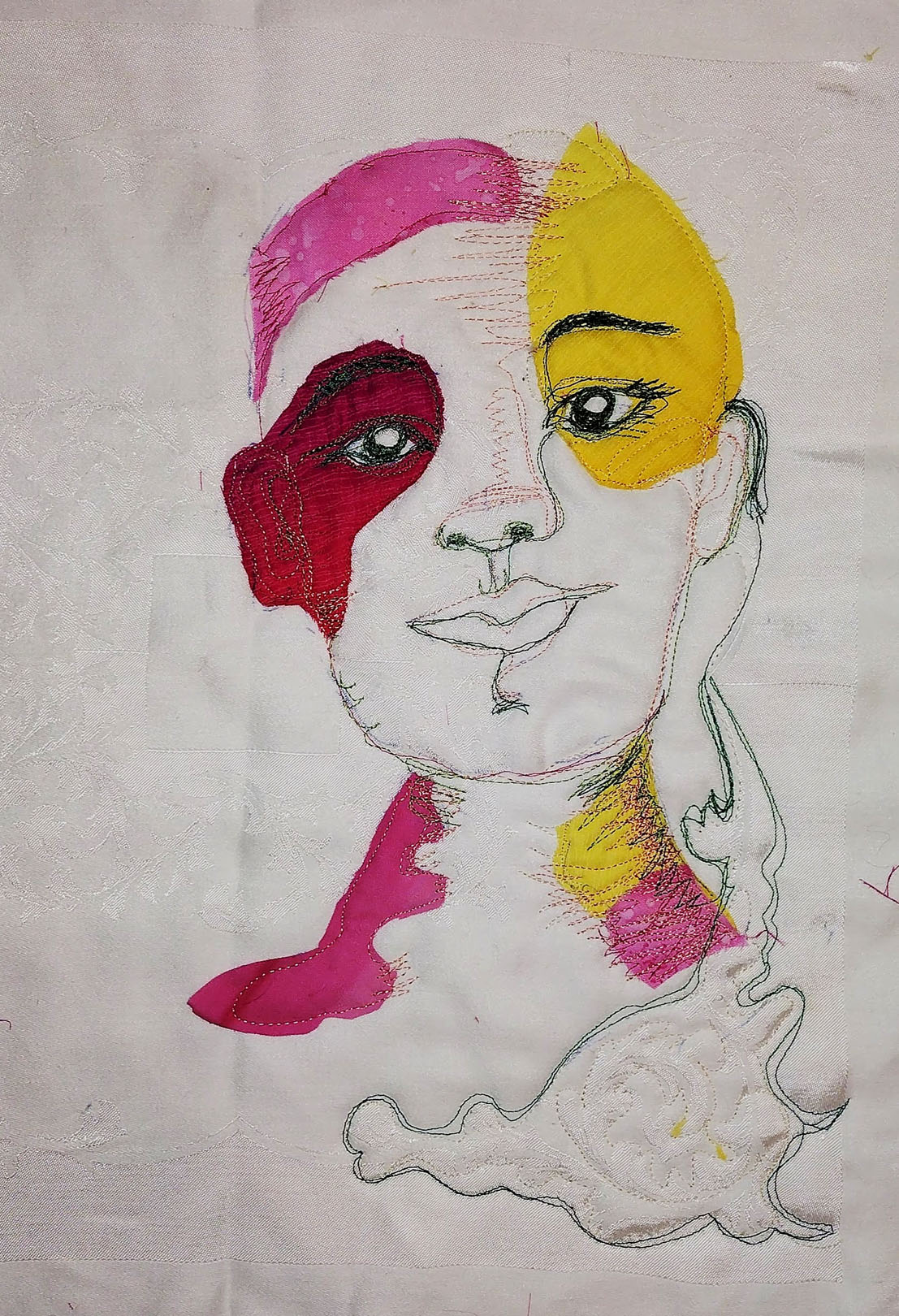
Starting the thread sketching.
Somewhere I had seen a tip to do free style applique by just stitching down big pieces of fabric first, and then cutting around whatever stitching you do, so I tried that to make the background for the hair.
Big blobs of silk for the hair.
Then I played with textile paint, acrylic ink, and thread sketching to make the hair strands. Some of the threads I used were very heavy so I put them in the bobbin and worked upside down, and I started to like the looks of the face that formed on the back as well. I thought the color gradations and sketchy lines of the fabric made it look more interesting than a quilt back usually does.
The reverse looked interesting to me too.
The hair on the front looks very thick and not wispy and airy like in the watercolor. As I stitched all the lines of flowing hair, she began to remind me of Botticelli’s Primavera, in spirit if not in style.
_04_ies.jpg)
Uffizi Gallery, Public domain, via Wikimedia Commons
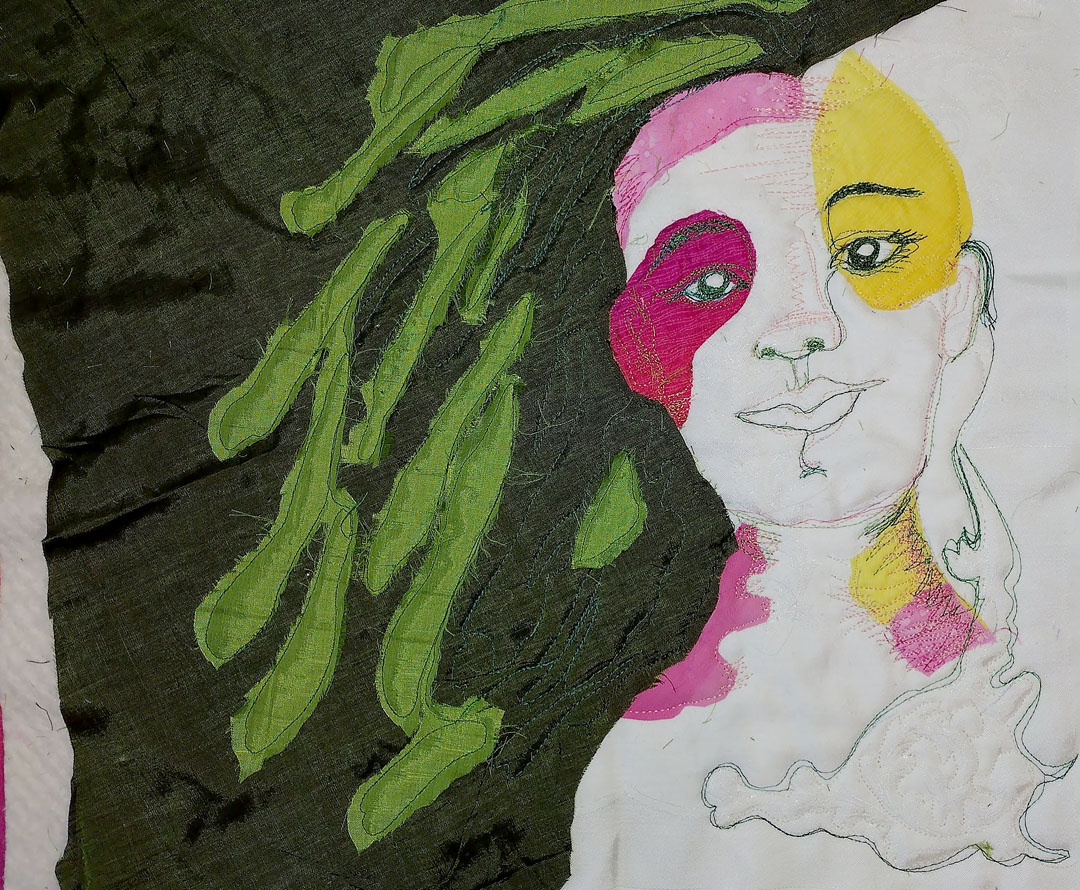
I thought about adding in flowers, butterflies, and dragonflies, but in the end I just added in a few leaves.
When it came time to do the binding, I thought the Gelato fabric was too bright and called attention away from the portrait, but fortunately I had a jelly roll of Laura Muir‘s Fresh as a Daisy collection from Moda (if you scroll down on that page, you can click to see a PDF of the whole collection), and those fabrics made the perfect complements for the double portrait. In fact, it would be fun to do another version, with those fabrics for the hair.
So here is the watercolor again, followed by its translation into fabric:
Watercolor sketch from a workshop.
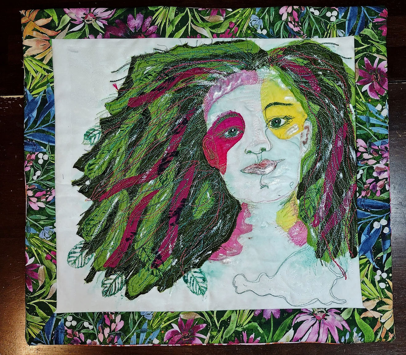
Primavera/Spring

Summer/Estate (the Italian word for summer — new vocabulary for me)
The damask napkin gives a nice base of texture.
I actually like the watercolor better, because the transparency gives it more vibrancy, I think. What is a pink forehead in the watercolor version, turns into an Olivia Newton-John sweatband for aerobics class on the quilted version, but it’s not a totally bad look; I think Primavera can carry it off. 🙂 And I loved the process of drawing with the sewing machine.
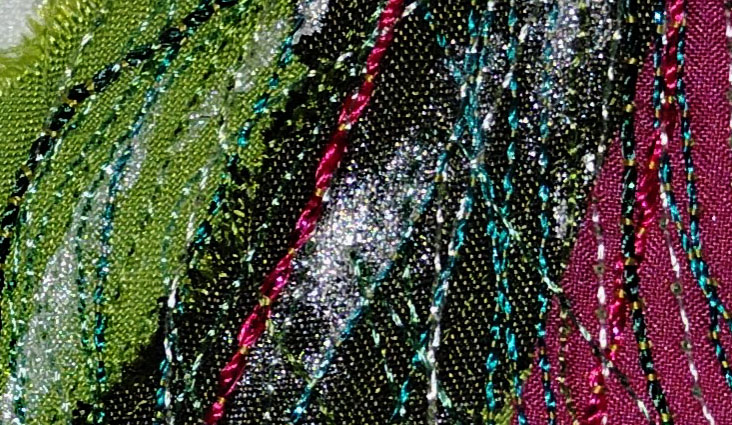
The heavy threads were put in the bobbin, and I stitched from the back with regular sewing thread, giving kind of a beaded effect.
Are you curious about what everyone else in the group has come up with? Some hints — a fly fisherman and his catch, an Andy Warhol inspired dog portrait, and a mug shot of a criminal sea gull! For these and other interesting portraits, please go and visit The Endeavourers!


This is really creative and fun! I think you did well. I should maybe go tell my post to publish immediately – I can never seem to get the timing right!
I think this went a little early, but usually I am late, so it all evens out. 🙂 The posts at the Endeavourers website aren’t up yet so I should have waited, but I think they will go up soon.
Totally PUNK! I like the back too.
OMG, I need to do a portrait of my hero P!nk!! to accompany this one. 🙂
OK, I will await that one. I like her also !
That is brilliant, your creative talent never ceases to amaze me!
Thanks, Chris, she was fun to make!
Just stunning. Your Primavera Princess is ready for Mardi Gras.
Thank you, what a good idea! I think she would love some Mardi Gras beads!
I agree with the others…beautiful, creative, and unique. Thanks for sharing. I am looking forward to seeing in person!
Thanks, Liz, I am glad to have her brightening up my room in this dreary weather. 🙂
Very lovely and creative!
This is a beautiful creation. I enjoyed seeing all the steps that built to bring this wonderful piece together. I feel she looks like a nature spirit heralding Spring 🙂
Thank you, Janine! I am so glad I found that Moda fabric to complement that portrait and express the feeling of spring!
That’s lovely. Have you discovered Gemma, and her hand embroidered (upcycled denim) fantasy ladies? https://www.instagram.com/the_sewing_songbird/ I love her work, it always brings joy into my day.
Oh, I just followed the link and she is amazing! I am not on Instagram so I never would have found her, thanks for letting me know!
Absolutely my pleasure.
Your work is amazing! And thanks for sharing the process : )
Very impressive and creative. I love how you transformed the piece in phases. The whole process is very challenging, yet very versatile.
Thank you! I had a lot of fun with this one. 🙂